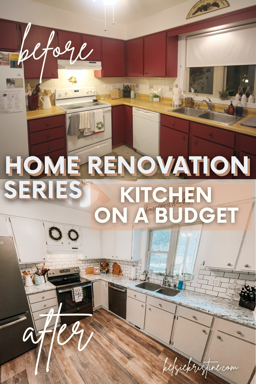
Today I’m sharing episode 3 of our home renovation series. If you missed episode 1 and 2 (living room and dining room episodes) check those out first. This post is all about our kitchen. This was the room we have been working on the MOST and over the longest period of time and we redid it on a MAJOR BUDGET! It was just finished with the last final touches this year so I have a lot to show you!! We’re going WAY back with these before photos, and you’ll be able to tell in the video too how old the footage is too (and how terrible and shaky my old camera was) 😉
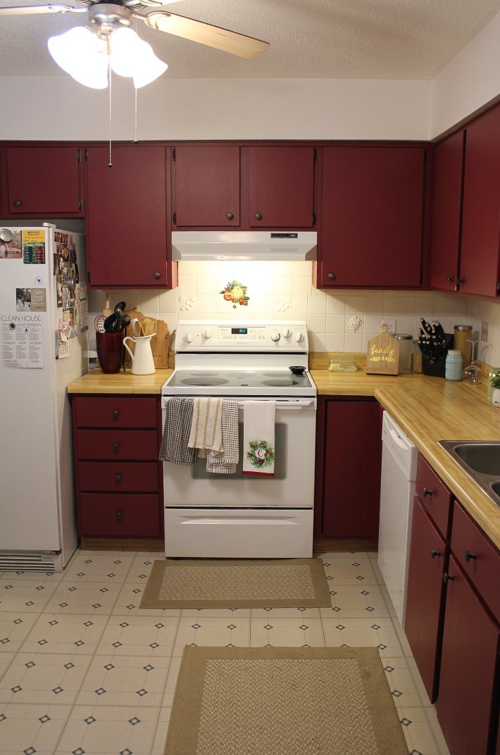
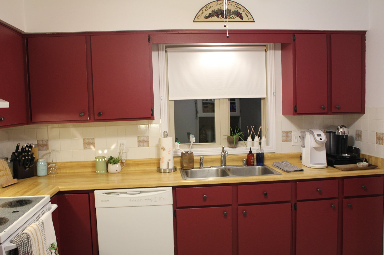
We bought our first home in 2015 and at first, we didn’t mind the burgundy cabinets. Soon after living in the house though, we couldn’t stand how dark the cabinets made the space, so we decided to paint the cabinets and remove the backsplash. The backsplash that was in there when we moved in was a square tiled backdrop, but one wall was one pattern and the other wall was another. (Story of our lives with this house as you may be finding…)
- BEFORE
- BEFORE
We have been doing all of these projects on the weeknights/weekends as we had time so that’s what took us so long to do them!
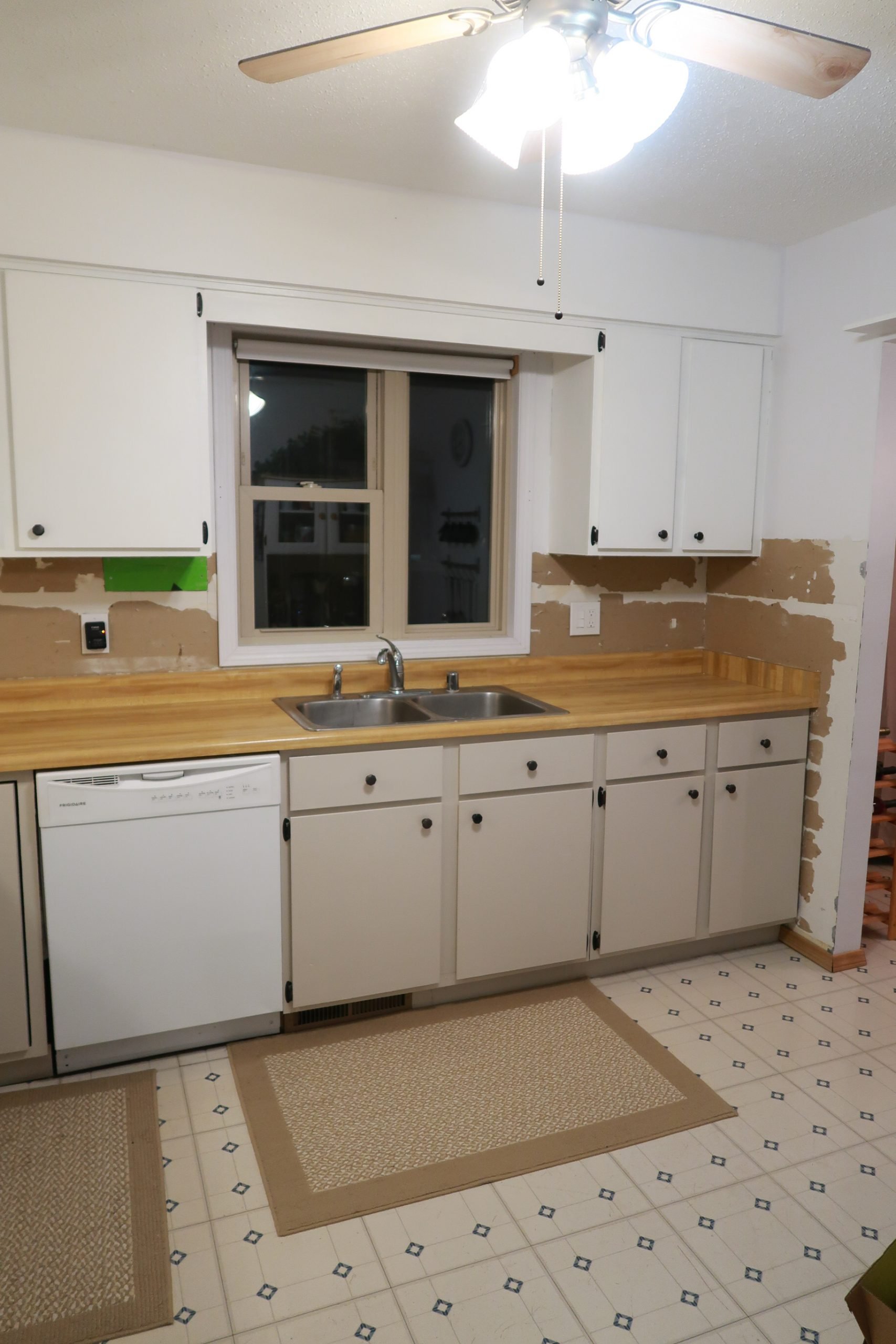
We painted the cabinets and removed the backsplash first. We went with a brighter white for the upper cabinets and a taupe color for the lower cabinets. We were originally going to keep the brushed bronze hardware, but after trying silver hardware, we found it looked much better. We lived with just the cabinets painted and no backsplash for several months before finally changing out the countertops. The old countertops were a faux butcherblock look that just didn’t go well in the space. We knew we wanted to redo the backsplash, but needed the new countertops in before we could do that. We chose to do a laminate countertop because we didn’t want to invest too much into them with the cabinets still being old. We chose the style that looked closest to a quartz/marble look with no splash guard and a double roundover edge. We also chose a new sink – we went with a quartz sink that’s specifically designed to be seamless with laminate countertops and we love how it turned out.
- AFTER PAINT
- AFTER PAINT
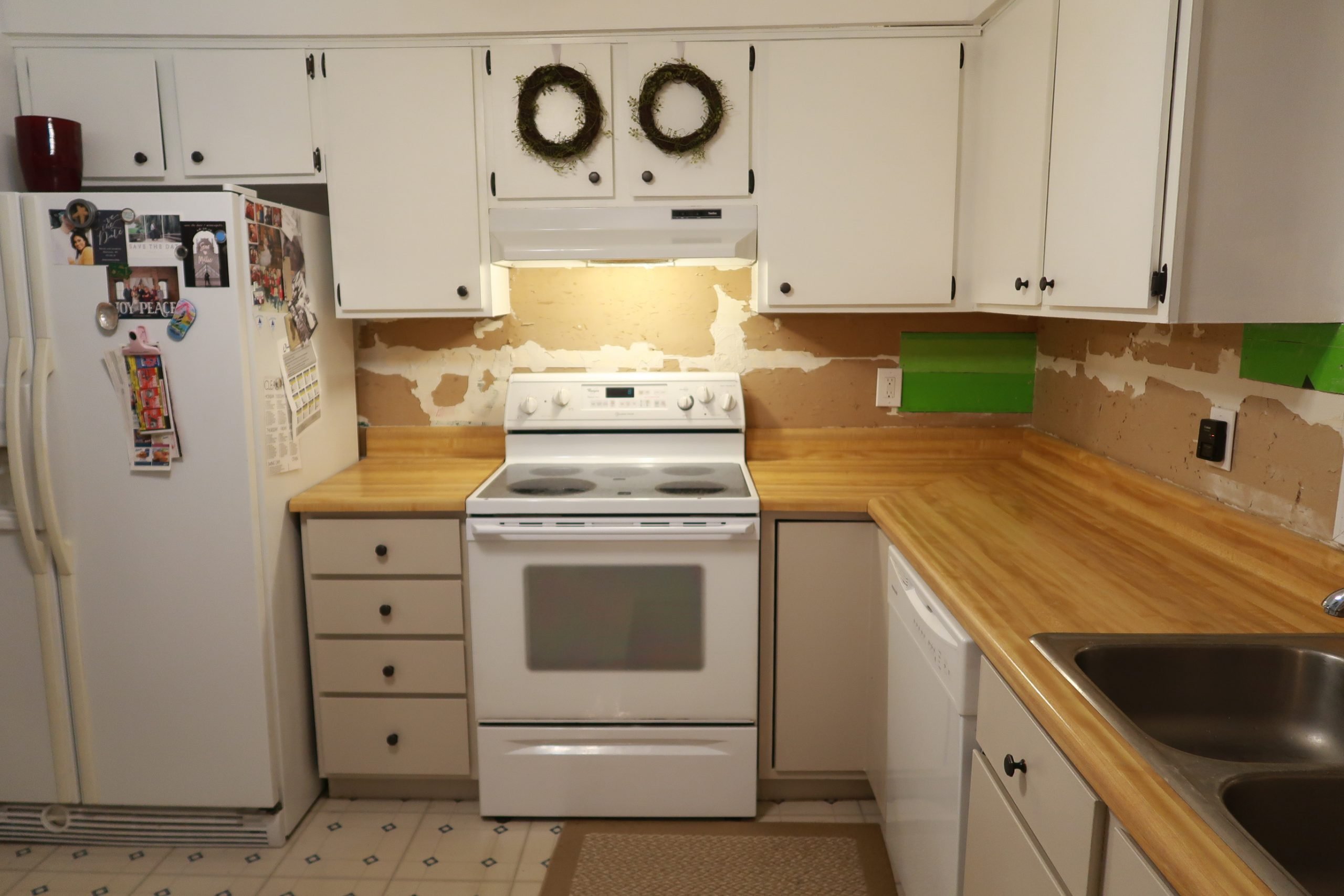
AFTER PAINT
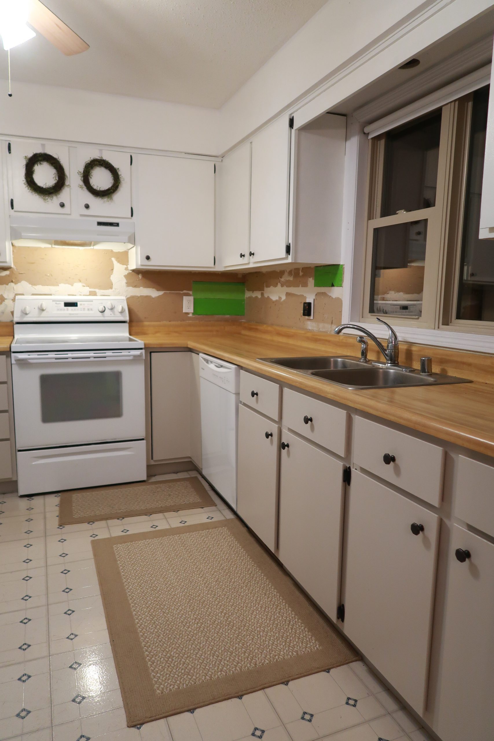
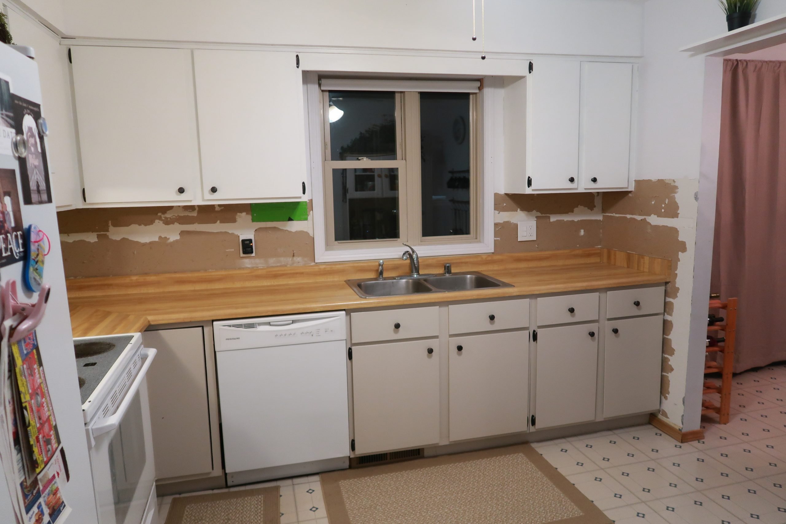
AFTER PAINT
After the countertops and sink were in, backsplash was next. We went simple with subway tiles. This is where we made a mistake. Conor and I had never installed backsplash before, but it was suggested to us not to use mortar and use a sticky adhesive. Although it was less mess, it made a LOT more work for Conor and if you made a mistake, it was harder to fix. With mortar, you can move the tiles around easier when placing. There’s a first time for everything, right?! We learned our lesson… For the grout, I wanted a lighter grey and we also made the mistake of not testing the grout before applying. It was WAY darker than I wanted (the sample in the store was not even close), but overall it ended up growing on me and once we got new appliances and flooring in the kitchen, it all tied together.
Appliances were next. Our stove stopped working one day so we decided it was time to update all of the appliances in the room at the same time. We had the older white appliances and upgraded to a slate grey matte stainless look. I believe we went with all GE appliances as well.
Flooring and new trim was the last thing to go into the room. There were 3-4 different baseboard trim pieces in the kitchen so we replaced all of it.
We installed the same LVP flooring from the living and dining room into the kitchen and the same PVC baseboard trim. We also painted the trim around the window above the sink to match the white baseboard trim.
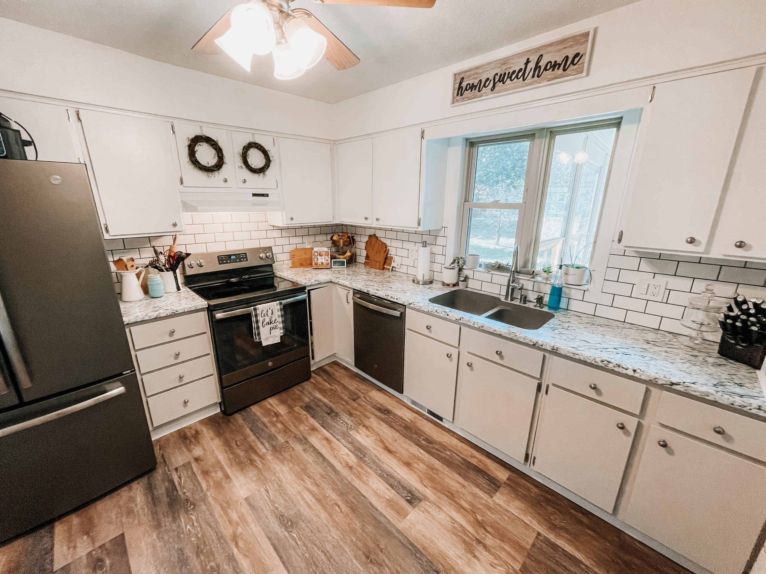
AFTER
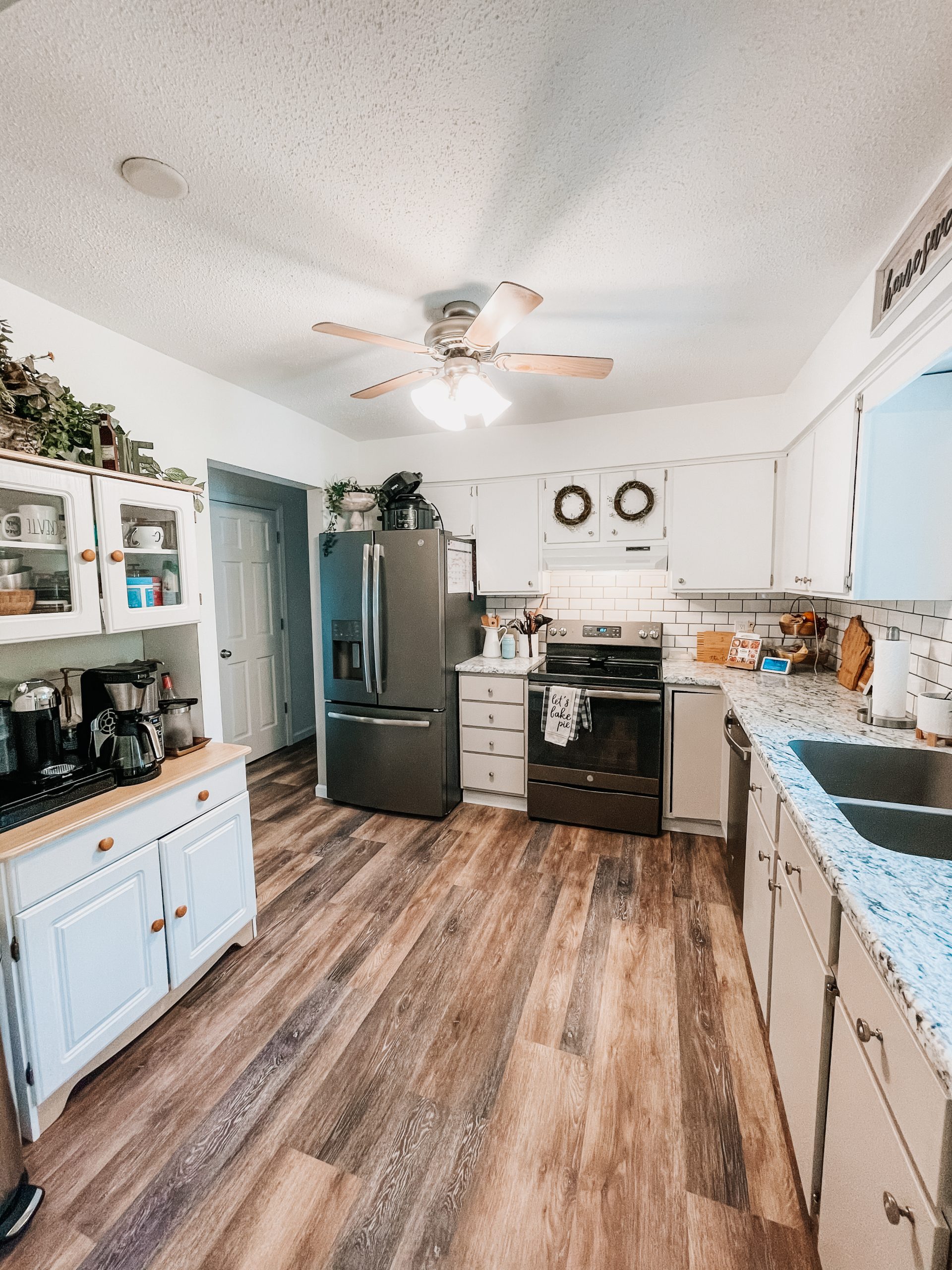
AFTER
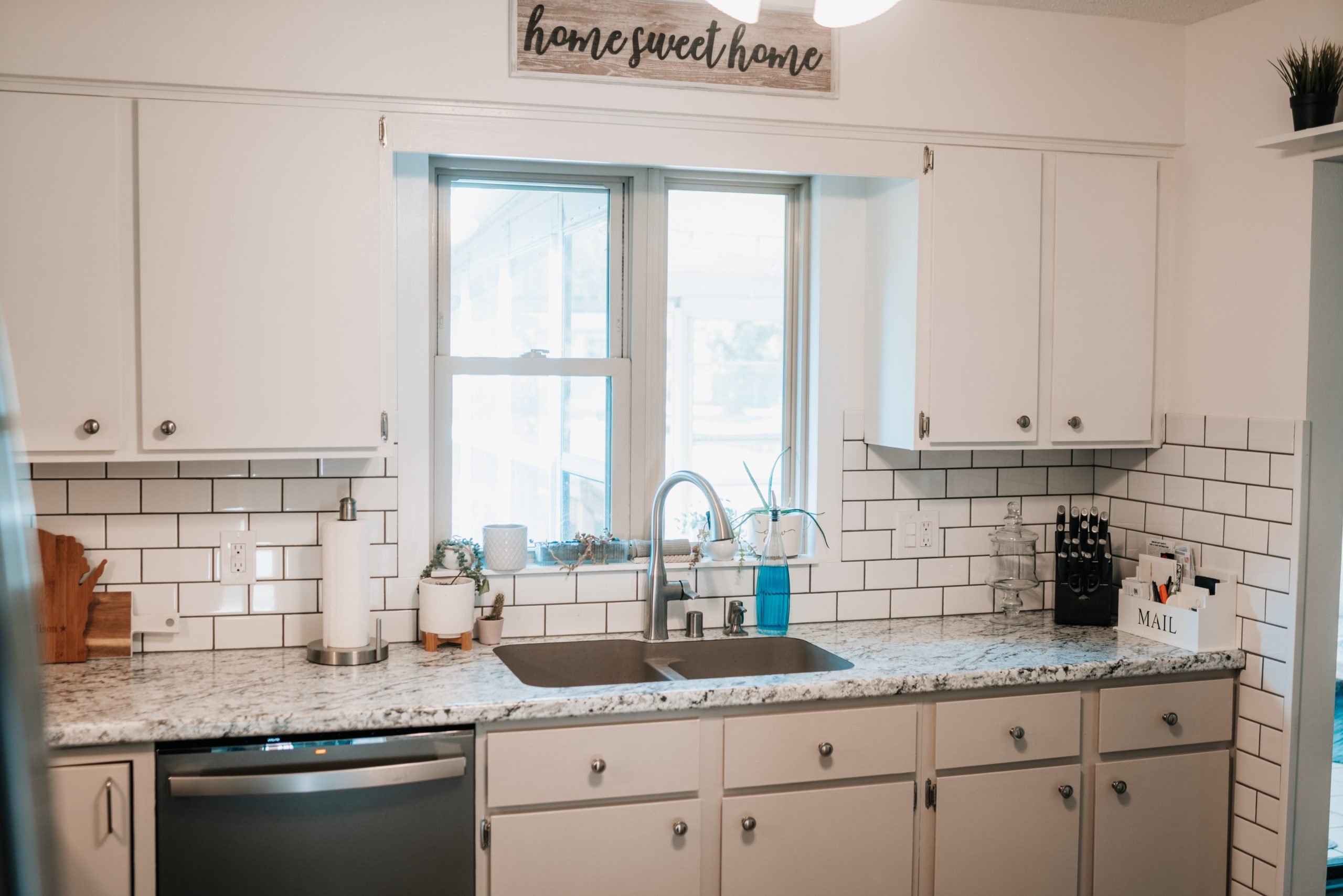
AFTER
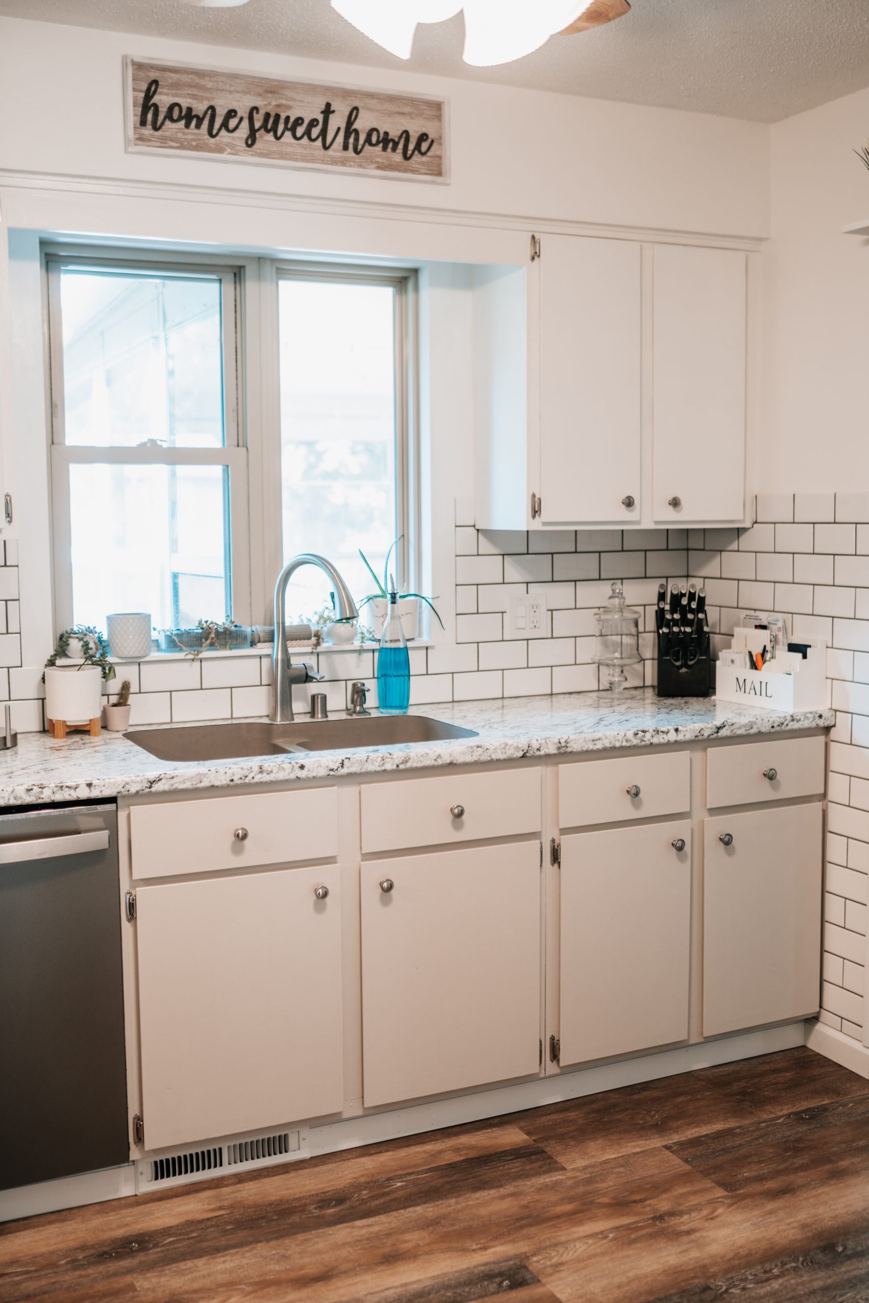
AFTER
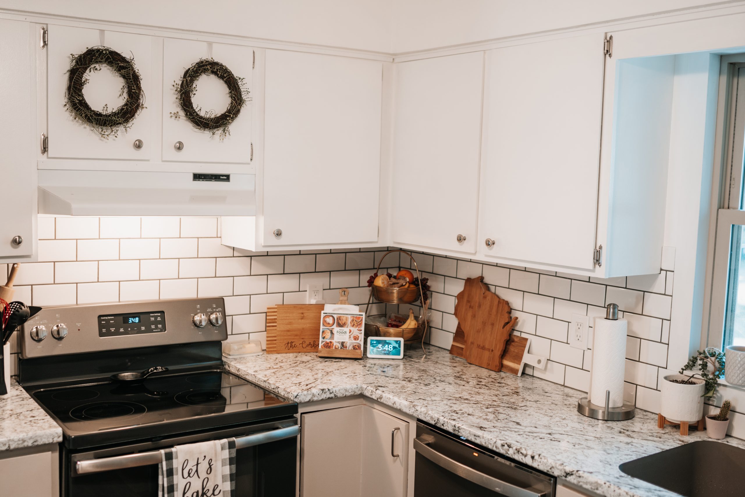
AFTER
I wanted to update the fan in the kitchen, as well as the light above the sink, but Conor didn’t want to. It works just fine for now, but may just be a future project if we feel like we’re ready for it. 😉 One last thing I want to do in this space is paint the curio cabinet. We knew we needed more storage in this room and my mom actually found it at a thrift store and it worked perfectly. I’d love to update the hardware on it and paint the wood look to a charcoal to tie in to the appliances. I’d also love to tint the glass to hide the clutter behind it. Overall it works well in the space though. We talked about adding cabinets there instead, but since the other cabinets are older, we didn’t want to try to match those and have it look like an older cabinet we’re installing, or we didn’t want to do newer looking cabinets because it would make the other cabinets look even older! The struggles… haha
HOME RENOVATION SERIES – EPISODE 3
It was a long drawn out process to complete this room, but it looks SO MUCH better than it did before and we saved a TON of money by doing it this way.
Product Links:
Backsplash – 3 x 6 Subway Tile
Appliances – GE Appliances in Slate (Fingerprint Resistant)
Upper Cabinet Paint – Night Blooming Jasmine by Behr
Lower cabinet Paint – Wheat Bread by Behr
SHOP:
Some of my Fav Kitchen Items:
What do you think of the outcome?! I think it turned out pretty well for being on a budget!
Thank you so much for reading/watching! Be sure to pin the image below to save this post for inspo for later!




Leave a Reply